Reference: StudentFilmmakers Magazine, August 2007. Using the Full Palette: Color is An Emotional Language by Dana Dorrity. Pages 30 – 31.
Recently some directors have been using a technique called the bleach bypass process, where color is stripped from a film, then, selectively reintroduced, giving the director total control of the spectrum. The results are movies like Million Dollar Baby, which had a denim blue tint and made me feel like I was viewing the film through a pair of jeans. I try to avoid these films. Watching them makes me tired. I think my brain is so busy trying to imagine what the color should look like, that I don’t have any energy left for the story. Most of these films have depressing storylines and the blue wash works to enhance the misery. I don’t want to imply that I go to movies to escape my otherwise drab life. What I will admit is if I’m watching a color film, I want to see color.
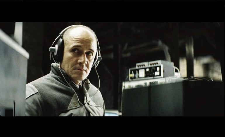
Traditionally, color was controlled through production design and costume. Director Florian Henckel von Donnersmarck used these traditional techniques in his film, The Lives of Others, to highlight the emotional differences between his character’s lives. The Stasi officer, Wiesler, played by Ulrich Mühe, wears a grey jacket buttoned up to his neck and sets up his surveillance equipment in a stark, unfurnished attic. The absence of color in his costume and environment is set up in contrast to the people he watches who dress primarily in warm browns. Their apartment seems bathed in yellow light to reflect their love for each other and their happy life together. The palette in this film is extremely limited, which also reflects the oppressive culture of East Germany, but it’s done through design rather than technology. All the colors are there, they are just muted.
Last summer, I attended a seminar class on color with a production designer who explained that color is an emotional language and directors must understand so that they can use it effectively.
Although red is the color of Santa Clause and Valentines, red is really the color of conflict. The production designer showed a scene from Minority Report to illustrate her point. In the scene, Tom Cruise and Colin Farrell walk through a pale blue futuristic office. As they enter an elevator with red walls, they begin to fight.
Directors have the power to create certain color metaphors or use color to define character, but the color itself also communicates. The color of the set can raise the viewer’s awareness of the characters’ inner lives without the viewer needing to think about it. These color cues can be given in costume, in the color of a character’s car, or even in the walls of the character’s apartment.
When Big, Chris Noth’s character on Sex and the City, painted the wall in his apartment bright red, it reinforced the passion between Carrie and Big. And, it sent a visual signal to the viewer that more conflict was coming.
As I was sitting in the seminar, all I could think about was the bright, red kitchen in my new house and how it seemed like my husband and I were arguing a lot more than we used to. I loved the boldness and red – as it was one of the first things that appealed to me about the house, but I knew when I got home that I was going to need to make a change.
I also realized it makes sense that I feel so out of balance after seeing a monochromatic film, because the director is limiting my emotions. Million Dollar Baby and Children of Men may be serious, somber films, but there should still be moments for emotional relief. When I was at the American Film Institute working on my MFA in screenwriting, our teachers taught us that we should use the full spectrum of emotion for all of our films. A comedy should have moments of despair, and even the grimmest horror movies need a few good laughs. In one of our first seminar classes, we were asked to recollect various moments in our lives: the most terrifying moment; the most embarrassing moment; a time when we laughed until we cried; a time when we said, I love you; our saddest moment; and a time when someone was furious at us. Then students were asked to stand on stage and recount their stories. After we had listened to a few, the teacher explained that these were the emotional beats of a movie – any movie.
Your character should fall in love, be terrified, do something embarrassing, get mad, be sad, and have at least one belly laugh. This is why a movie as silly as Snakes on a Plane delivers a satisfying viewing experience. It’s why we love it when Sam Jackson delivers his line about how he doesn’t want to see another “$@%& snake on the #$%&-ing plane.” In that scene, he’s really angry, but in another scene he falls in love, and in a truly sad scene, he loses someone he cares about. I’m not saying the Snakes on a Plane was the greatest movie of the year, but there’s a reason why that script got made. It delivers a story in full color with the full spectrum of human emotion.
Colors can all be used for either a positive or negative effect. If a young woman wants to impress a man at a party, she’ll probably show up in a bright, red dress. Red is passion as well as power, but both of these things usually stimulate conflict. Blue, on the other hand, is a calmer, more philosophical color. Blue can be dignified, but it can also seem passive. It’s probably the better choice for a job interview when you want to seem confident, but not aggressive. Yellow is a lively color, like daffodils in the springtime, but it’s also the color of warning signals and police tape.
When Uma Thurman puts on her yellow motorcycle costume in Kill Bill, it sends a warning to the other characters to stay out of her way. Imagine the same scene in blue or red; it just wouldn’t be the same. Green is the color of nature, but when a film has an overall green hue, like Seven or Fight Club, the world feels sickly and poisoned.
If I don’t see red, yellow and cyan at some point in a movie, it’s as if the characters never cracked a smile, or possibly even worse, never stopped smiling. And, I find that a film (like The Matador) that alternates between dominant primary colors in the background will give me a strong feeling of satisfaction – almost a visual catharsis. I loved The Devil’s Rejects, even though I don’t generally like horror, because it used the full spectrum of color. And amazingly, even though the characters are reprehensible murderers, there are moments of real joy and kindness between them to counterbalance the violent frenzy.
In case you’re wondering, I did repaint my kitchen. I tried burnt orange, dill pickle green, and finally arrived a bright, light blue – a passive, intellectual color that allows me to read the paper, drink my coffee, and get along with others.
Dana Dorrity is an assistant professor of Communications and Media Arts at Dutchess Community College. She has an MFA in screenwriting from the American Film Institute and teaches media writing, screenwriting and video production classes.