By Ira Tiffen
If everything in front of the camera is perfect, you need no filter. Ira Tiffen explains what filters are really good for when things aren’t perfect.
The fact is, if everything in front of your camera is exactly right, all you need to do is record and render it back faithfully to have achieved excellence in imagery. Unfortunately, that happens about as often as winning the lottery. Less often, perhaps. That’s why there’s all this other stuff, like filters, to help out with the job.
Let’s look at the following typical situation. The sky is just not cooperating. Nothing you say can get it to look “vibrant.” Can’t offer it a residuals increase, nor a larger dressing trailer, nor anything that will get it to show its brighter, more colorful side. You could get a set decorator in but, really, apart from hanging some drapes that sky is still going to look washed out and dull. What to do?
Well, you could wait for Nature to provide a more thrilling countenance. But, what, you say, that’s not in your budget? Understandable – can’t have everyone standing around waiting weeks for the right moment. Perhaps, just maybe, there’s something else you could try instead.
Sometimes, no matter how you try, you just can’t time it right or wait for things to come around to your way of looking at them. But you can help them along in some ways. That’s where filters are most useful.
Let’s first take the mountain silhouette image. Without a filter it’s practically pure black and white; light and dark with no color interest. Now let’s use a Tiffen Cool Day-for-Night filter and see what we get. While not quite the use for which the filter was originally designed, it does make the scene come alive…in cool, dark, blue tones. This filter also reduces contrast, which you can see in the slightly lifted shadows of the mountains. Right away, the image projects the quiet new presence of evening. The day is behind us. This may be just what you were looking for. But in case it’s not, we’ll now try something different.
Using a Tiffen Twilight 3 filter, a variation on the standard Color-Grad™ that has two levels of color, a lavender-blue and a pink, before gradually fading to clear, we align the pink section of the filter with the brightest part of the image, and we can see and evaluate the result. The brilliance of the sun, here, is given an ominous power, glowing warmly. The tint creates visual heat, in opposition to the earlier Cool DFN rendering. This, perhaps, may be just what you are looking for. But in case it’s not, we’ll try combining the two filters to see what we get.
The combination of the Twilight 3 and the Cool Day-for-Night filters creates an almost opalescent aura, pale pink at the luminance source, gradually fading to cool lavender toward the edges. We’ve combined the strongest elements of each filter to come up with this more energetic enhancement of the black and white unfiltered original. While you might eventually see these colors in nature, waiting for them to appear on their own would not be advisable.
Moving right along, we’ve got another standard situation to consider in the daylight view of moderately interesting clouds floating high above a distant mountain-lined horizon. Nice blue sky, but no real drama. And if we were thinking ‘polarizer!’ we would soon notice that the angle to the sun, which is almost behind us, is wrong for efficiently affecting the blue sky in this scene with that worthy filter. You’ll remember that the sun needs to be to our side or more overhead (in any case, at about a right angle to our camera’s direction of view) for the polarization axis of the reflected skylight to coordinate with the filter to advantage.
Instead, we’ll first employ an 85C, a less-intense version of the 85 conversion filter. The warm salmon tones now pop; the sky is still recognizably real, yet overall color interest increases substantially. Rather than seeming to be ‘midday’ as the unfiltered original, now the suggestion is variously early or late, the color that of a sun lower in the sky that it actually is.
A previously nonexistent chromatic contrast was created by the 85C between the now-warm tones of clouds and grasses and the cooler blue of the open sky. Just a simple alteration to the color balance of such a scene adds energy and visual interest, propelling the viewer more firmly into the environment, and thus becoming more involved in the story that takes place there.
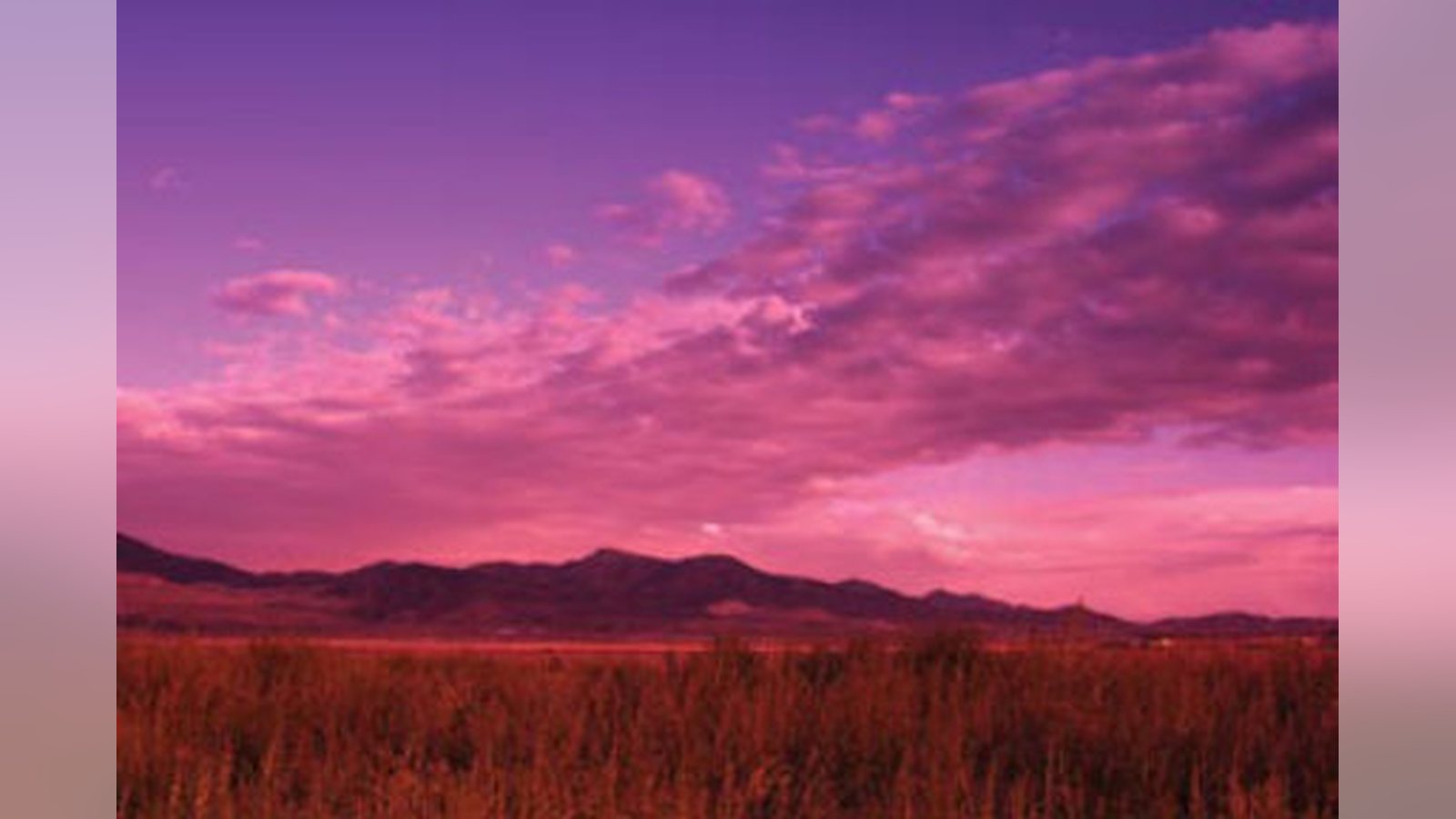
We can take this a step further, again with the addition of a second filter; and again we’ll add the Twilight 3 grad to the first. Here, the individual pink and lavender tone of the second filter come into their own, strongly aligning with the disparate image segments, foreground foliage, clouds and the clear sky. The effect is mesmerizing; where once there was dull reality, now the brilliance of color, contrasting lavender and pink, gets the eye’s attention and thus the viewer’s interest.
And we’ve managed all this without having to wait patiently and exhaustively for exactly the right moment. Instead, we can give Nature a hand, and our camera lens a filter, and be happily on our way. In over 30 years of making optical filters, Ira Tiffen created the Pro-Mist, Soft/FX, Ultra Contrast, GlimmerGlass, and others, netting him both a Technical Achievement Award from the Academy of Motion Picture Arts and Sciences and a Prime-Time Emmy Award. Elected a Fellow of the SMPTE in 2002, he is also an Associate member of the ASC, and the author of the filter section of the American Cinematographer Manual.
Related filmmaking guides
Keep learning filmmaking
Want more lessons like this? Join StudentFilmmakers free for live webinars with working pros, and stream on-demand filmmaking classes in cinematography, directing, screenwriting, sound and post.